


You sent us a Pantone chip and approved a render. The first sample arrives, your team holds it under the office light, and someone says, “this isn’t the color we picked.” That gap is the entire subject of this article.
Most brand teams treat the ferrule as a small metal sleeve that holds the bristles to the handle. From a production standpoint, it is the single most color-sensitive component in the whole brush. It is metal, it is reflective, it sits between two other colored parts, and it is finished by a chemical process — not a printer.
When you hand a custom makeup brush manufacturer a Pantone code, what you are really asking is: “Grow this color into an aluminum sleeve, in a way that reads the same under retail lighting, across thousands of units, in different bath runs, on multiple alloy lots.” Ferrule color matching is a discipline because every word in that sentence has its own variance. It is closer to dyeing fabric than to painting a wall.
The job here is simple. We want you, the product or design lead, to understand what happens on our floor when we anodize your ferrule, where the color can drift, and what to put in your spec sheet so round-one sampling lands close to right. Brand teams that get this right cut their color rounds in half.
Anodizing is not painting. Painting lays a colored layer on top of a substrate; anodizing grows a colored layer into the substrate. That distinction is the whole reason ferrule color matching behaves the way it does.
Here is the short version. A raw aluminum ferrule goes through a cleaning and etching pre-treatment so the surface is chemically uniform. It then enters a sulphuric-acid electrolyte bath, where an electric current grows a porous aluminum oxide layer on the metal — typically a few microns thick, colorless, and full of microscopic pores. We transfer the ferrule into a dye bath. The dye soaks into the pores. Finally we seal the ferrule, usually in boiling water or a nickel acetate bath, which closes the pores and locks the dye in.
The finished ferrule color is the dye, sitting inside the metal’s own oxide layer, viewed through a translucent ceramic-like film. That is why an anodized aluminum ferrule has the depth and luminosity that paint cannot replicate. It is also why the same Pantone reference can look subtly different on aluminum than it does on a paper chip — and why the choice of matte, satin, or gloss surface texture changes how the color reads even when the dye recipe is unchanged.
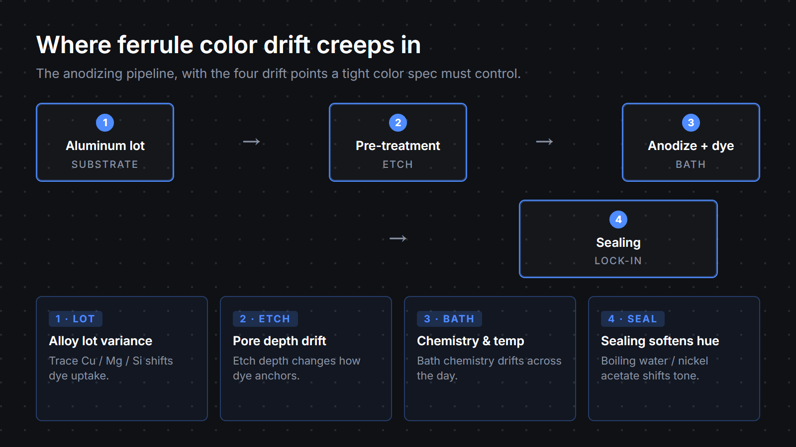
Once you understand that anodizing is a chemical growth process, the places where drift can sneak in become obvious. There are four of them on our floor, and a tight color spec has to account for each.
Aluminum alloy lot variance. Two aluminum lots that pass the same alloy-grade specification can still absorb dye at slightly different rates. Trace differences in copper, magnesium, or silicon content shift how the oxide layer grows, and that shifts how the dye anchors. We pull from controlled alloy sources, but lot-to-lot variance is real. This is why we batch-match against a stored master chip, not the digital Pantone alone.
Surface prep and pre-treatment. Etch depth determines how porous the oxide layer becomes, which determines how much dye the metal can take. Too shallow and the color reads pale. Too aggressive and the color goes deeper than spec, sometimes with a slight haze. The pre-treatment chemistry has to be tuned for the alloy and held steady across the day.
Anodizing bath chemistry and temperature drift. Sulphuric acid concentration, current density, and bath temperature all influence the oxide layer thickness and pore structure. A bath that runs warmer in the afternoon than it did at 8 a.m. will produce ferrules that read a half-step different from the morning batch. We monitor the bath continuously, and the operator’s job is to hold the parameters inside a narrow window across the whole shift.
The sealing step. Sealing closes the pores but slightly shifts hue and gloss. Boiling-water seals are gentler; nickel-acetate seals are more durable but can warm a cool tone half a step. On a Korean K-beauty program we matched a matte rose-gold cleanly off the chip and the sealing step softened the hue by half a tone. We added a sealing-step audit to the master spec and the second run came back inside ΔE 1 against the approved chip.
Four steps, four sources of drift. They compound. A spec that ignores any one of them is rolling dice on the others.
Brand teams approve a lot of ferrule colors off a screen. We understand why — the design system lives in Figma, the brand book is a PDF, and the Pantone library is right there in the swatch panel. The problem is that none of that represents what your finished ferrule will actually look like.
A computer monitor is an emissive RGB display — it makes color by shooting red, green, and blue light at your eye. A finished ferrule is a reflective metal surface; it has no light of its own and shows you whatever your environment shines onto it, filtered through that translucent oxide-and-dye layer. No monitor calibration profile will close that gap, because it is not a calibration problem — it is a substrate problem.
Then layer in the lighting. A ferrule looks one way under D65 daylight (5000–6500K), another way under warm 3000K office tubes, another under a phone screen, and yet another under retail track lighting. An EU clean-beauty brand approved a champagne-gold off a digital swatch and the production ferrules came back looking faintly green to them under their retail lighting. The dye chemistry was correct; the review environment was wrong. A single physical chip approval under D65 fixed it and the next batch shipped on tone.
Surface texture compounds this. Matte scatters light and reads muted. Satin holds the most depth in most colors. Gloss reads brighter and shows micro-defects. The same Pantone reference in three textures reads as three colors to your eye even when the dye recipe is identical. None of that shows up on a monitor.
The good news is that a tight spec removes most of the variance before sampling starts. We would rather spend a week up front getting the spec right than three weeks chasing a sample your team is unhappy with. Below is the brand-side checklist we hand to product leads kicking off a new ferrule program.
Hand a factory those seven items and most of the round-one sampling pain disappears. Hand them a Pantone code alone and both sides are guessing.
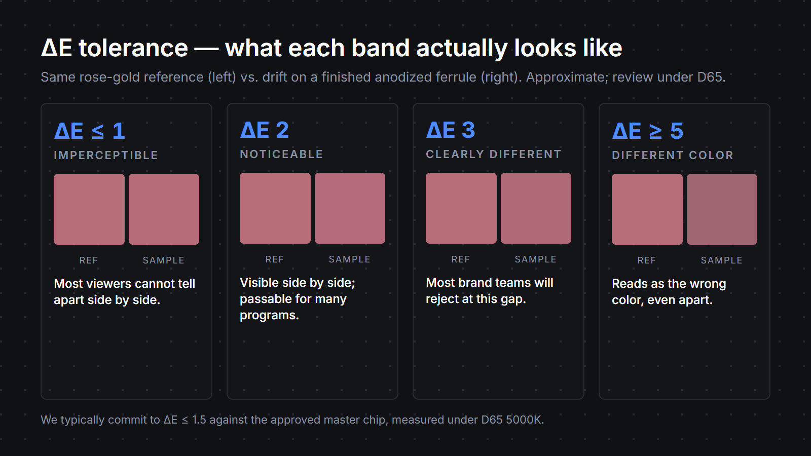
A note on ΔE for brand readers who haven’t met the term before. ΔE is the standard quantitative measure of color difference between two samples, read with a spectrophotometer in a defined color space against a defined illuminant. ΔE around 1 is where a trained eye starts to see a difference side by side; ΔE around 3 is where most consumers see a difference at arm’s length. Treat ΔE as a real spec term and it shows up usefully in your contract.
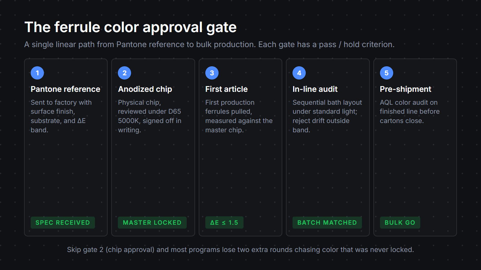
This is the part of the process that nobody outside a real makeup brush factory sees, so let us walk you through it.
When a new ferrule color program starts, we first produce three to five anodized chips at slight variations around the target dye recipe. They sit on a viewing table under a D65 5000K lamp, on a neutral grey background, alongside the brand’s reference. Our color lead picks the closest, then dials the recipe until a single chip locks against the reference inside the agreed ΔE band. That chip becomes the master. We file a duplicate in the chip wall — a physical archive of every approved master from every program we have run — so we can pull it months later for a reorder.
Bulk production then runs in sequential bath layout. Ferrules from each bath come out, get rinsed, get sealed, and get laid out in trays under the same D65 lamp the master was approved under. The line operator pulls a sample from each tray and compares it side by side against the master chip. Anything that drifts outside the ΔE tolerance gets pulled and re-run. There is no shortcut to this — a spectrophotometer reading helps, but the human-eye check under standardized light is the one that catches the things a numerical reading misses, like a faint cast shift that only shows up at certain viewing angles.
Operators learn to read a ferrule by feel. A piece pulled fresh from the dye bath has a wet, slightly darker appearance; you have to know how the color will set up after the seal. The chip wall is the institutional memory that holds that knowledge across operators and years. A US indie brand once chased a deep navy across three rounds because their team was reviewing samples under 3000K warm office light while we were matching under D65. The ferrules looked perfect under D65 and slightly purple under their warm light. Standardising the review light cut their next program from three rounds to one.
Color audit on the finished line is the last gate. Before ferrules go into crimping and assembly, a final batch sample lands back on the viewing table. We grade against the master, log the ΔE, and either release the lot or hold it. That log travels with the production records and forms part of the trail a third-party pre-shipment inspection can review.
Because anodizing grows color into the metal rather than painting it on, the same Pantone reference behaves differently on aluminum than on a paper chip. Substrate, surface texture (matte / satin / gloss), and the lighting you review under all shift the perceived hue. We always recommend approving a physical anodized chip — not a digital swatch — before bulk runs. In practice, the same Pantone can read warmer or cooler depending on alloy lot, etch depth, dye bath chemistry, and the sealing step. Lock the chip; lock the lighting standard; review against both.
A spec a factory can deliver against has six things: the Pantone or LAB reference, the surface finish (matte / satin / gloss), the substrate (aluminum alloy series or ‘match approved chip’), the lighting standard for review (D65 5000K is the practical default), the ΔE acceptance band against the approved master chip (we typically commit to ΔE ≤ 1.5), and a first-article inspection sign-off before bulk. Without those, color matching becomes a back-and-forth of subjective opinions instead of a measurable QC step. We recommend brands lock all six on the kickoff call, not after round one.
With a tight spec sheet and a physical chip approval at the start, most ferrule colors land inside ΔE 1.5 by round two. Without the chip approval, brands often run three to four rounds and still see drift in production. The single biggest accelerator we have seen on real programs is locking the review lighting to D65 before round one. Brand teams reviewing samples under warm office light or phone screens chase color drift that exists only under those non-standard conditions. Standardise the light and most of the perceived problems disappear.
No. Plastic ferrules are typically painted or color-injected, which has its own variance pattern (paint thickness, drying conditions, batch chemistry of the paint), and most plastic brands use a different reference workflow. Copper ferrules are often left as raw or lightly lacquered, where color is the natural metal patina rather than a dye system. The anodizing-specific drift sources we describe — alloy lot variance, etch depth, dye bath chemistry, sealing — apply only to anodized aluminum. For each substrate, a separate spec discipline applies; the principle of physical-chip-first approval still holds.
ΔE (delta E) is the standard metric for the perceived difference between two colors. Roughly: ΔE ≤ 1 is imperceptible to most viewers, ΔE 2 is noticeable side by side, ΔE 3 is clearly different, and ΔE 5+ looks like a different color. For ferrule color matching against a master chip, we typically commit to ΔE ≤ 1.5 in production. Asking your factory to state their ΔE acceptance band in writing — and to measure under D65 lighting with a calibrated spectrophotometer — is the single biggest spec upgrade most brands can make on their first OEM makeup brush project.
