


Every December, beauty brands start asking the same question: which trend colors are actually worth turning into products?
In makeup brush manufacturing, a trend color is not a moodboard decision.
It is a coating decision. A ferrule decision. A packaging-coordination decision. It sets your sampling timeline and your MOQ math.
Some 2026 colors look beautiful on Instagram and become unstable in mass production. Others are easy to manufacture and age out of relevance in nine months.
As an OEM makeup brush factory, we spent the last several months running real samples of the major 2026 forecasts across anodized aluminum, painted plastic, and stained wood. The goal was simple: see which 2026 color trends actually translate from Pantone chip to retail shelf.
What we found is that 2026 is unusual. The two biggest forecasts disagree. Pantone went one way; WGSN went the opposite. This article tells you which direction works for your category.
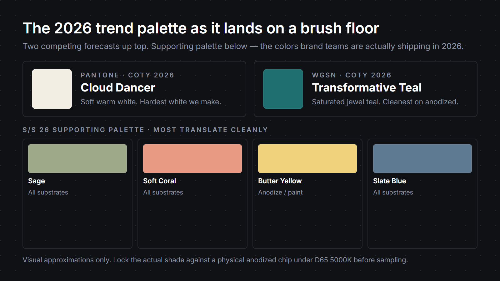
Pantone Color of the Year 2026 is Cloud Dancer — a soft warm white, announced in early December 2025.
It signals airiness, calm, and near-neutral simplification. Some of the design press read the choice as commercially safe. Worth knowing — your customer may be reading the same critique.
WGSN’s 2026 Color of the Year is Transformative Teal — a saturated jewel teal, published in parallel with Pantone’s announcement.
It signals depth, confidence, and a more dramatic shelf presence.
Around the two anchors sits the Coloro × WGSN S/S 2026 supporting palette: sage, soft coral, butter yellow, slate blue. These are where most brands will actually spend their development budget. Hero-COTY commitments are rare; trend colors usually land as accent SKUs.
Two names, one supporting palette. That is the 2026 menu most beauty brands need to know going into Q1.
Cloud Dancer reads premium on a moodboard. Then it gets to the production floor.
Warm white shows everything. Fingerprints. Ferrule gaps. Glue lines. Color drift between batches.
For a clean-beauty founder, that fragility is part of why the color feels premium. For the QC team, it means more sampling rounds and tighter component tolerances.
The honest path for warm white is plastic. UV-stabilized resin holds Cloud Dancer cleanly across a one-year retail cycle. Anodized aluminum cannot match it — anodizing in white tops out at pale ivory with a faint silver-gray cast, visible side by side with a true white handle.
Most Cloud Dancer programs we see in development right now use oversized powder and buffing brush shapes rather than dense kabuki silhouettes. The softer profile matches the palette better on shelf, and the larger surface area gives the warm white room to read as the design choice rather than a coincidence.
Factory Note
We budget one extra sampling round on every warm-white program. Ferrule-to-handle drift shows up roughly three times faster on Cloud Dancer than on a saturated jewel tone, so we plan that round into the calendar rather than discover it in week six.
Transformative Teal is the opposite story. Dramatic on shelf, forgiving in production.
Saturated colors are simply easier to keep visually consistent across batches. Minor tonal drift between batches reads as “teal” before it reads as defect — a quiet gift to QC.
The dye chemistry for jewel teals on anodized aluminum has been refined for decades on consumer electronics and eyewear. A custom makeup brush manufacturer can hit a tight ΔE on anodized teal reliably, usually inside sample round two.
For a Sephora-bound prestige line, the math is compelling: dramatic shelf presence, anodized handle, predictable repeatability across reorders. The trade-off is commitment. Saturated teal dates a launch to its season in a way warm white never does.
The supporting palette behaves predictably. Sage anodizes cleanly and reads wellness. Soft coral works best painted; anodized coral pulls either too pink or too orange depending on the alloy lot. Butter yellow is the secondary risk color — it shares Cloud Dancer’s habit of showing every imperfection. Slate blue is the easiest of the four.
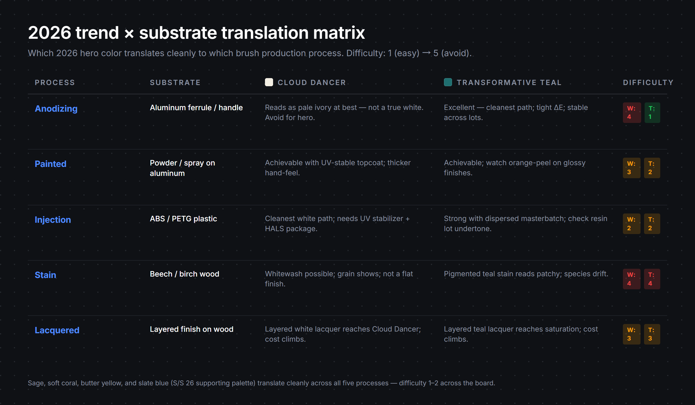
The matrix below is the working reference we share with brand teams on kickoff calls. Difficulty runs 1 (clean and predictable) to 5 (specialist, multiple trial rounds expected).
| Trend Color | Best Substrate | Difficulty | Best Brand Style |
|---|---|---|---|
| Cloud Dancer (warm white) | UV-stable plastic injection | 4 | Minimalist clean-beauty, soft-touch packaging |
| Transformative Teal (jewel teal) | Anodized aluminum | 2 | Bold prestige, metallic accents |
| Sage (S/S 26) | Anodized aluminum or matte-painted wood | 2 | Wellness, natural-skin, refill systems |
| Soft Coral (S/S 26) | Painted aluminum or lacquered wood | 3 | Warm-pastel K-beauty, gifting capsules |
| Butter Yellow (S/S 26) | UV-stable plastic injection | 4 | Playful prestige, summer drops |
| Slate Blue (S/S 26) | Anodized aluminum | 1 | Quiet luxury, masculine-leaning lines |
The strategic read most brands miss: hedging usually wins. Brands pairing a Cloud Dancer hero with a Transformative Teal accent — or a teal-led capsule with a slate blue and butter yellow supporting cast — tend to outperform brands going all-in on a single forecast.
The point of a trend color is to add seasonal energy to a coherent line. Not to replace the line.
Factory Note
If your brand sources handles, ferrules, and packaging from three different suppliers, lock the warm-white reference chip with all three before any of them tools up. Cross-component drift kills more Cloud Dancer launches than dye chemistry does — we have shipped two recovery runs this year to brands who skipped this step.
This is the pattern we see on our floor across briefs landing right now. Not theory — what brand teams are actually building for Spring–Summer drops.
Clean-beauty brands are leading with Cloud Dancer on the hero handle and pairing it with matte sage on the accent SKUs. The combination reads minimal and modern without committing to a single trend forecast.
K-beauty launches are skipping both COTYs and going straight to soft coral and butter yellow, often in a single capsule. The S/S 26 supporting palette is doing the COTY work for them. Cheaper to produce, faster to sell through, easier to extend into private label makeup brushes for retailer exclusives.
Prestige and Sephora-bound brands are betting on Transformative Teal — anodized teal ferrule, dark navy handle, chrome logo. The look is editorial and confident. The substrate math is clean. The launch reads “this is for 2026” without saying so on the label.
The teal launches performing best right now are almost always paired with chrome or matte-silver logo treatments and soft-touch cartons rather than glossy boxes. Glossy boxes fight the saturation of the brush; soft-touch absorbs light the same way the anodized teal does, and the unboxing feels coherent instead of competing.
DTC-first and TikTok-native brands are reaching for soft-touch warm neutrals — usually a Cloud-Dancer-adjacent off-white plus slate-blue accents. The matte finish photographs cleaner in vertical video; the neutral palette pulls focus to the bristle and the swatching demo, which is where the content lives.
The takeaway across all four archetypes is the same. Pick the color to amplify your brand identity, not to perform the COTY.
The strongest 2026 launches are not matching sets. They are coordinated systems where the brush, the cosmetic brush packaging, and the unbox all move together.
A working stack from this season:
That pulls Cloud Dancer, Transformative Teal, and one supporting palette color into a single unboxing moment without forcing one color to do all the work. If you are scoping packaging alongside the brush spec — and you should be — your color decisions are interconnected from the kickoff call, not bolted on at the end.
In beauty tools, the trend color rarely fails on the moodboard. It fails in repeat production.
We see the same patterns every December–February cycle.
Picking the COTY because it is the COTY. The Color of the Year is a marketing event, not a brand strategy. Forced trend SKUs confuse your customer and age fast.
Stretching one trend color across the whole 8-piece set. A full set in a single tone reads monotonous and amateur on shelf. Trend colors land best as one or two accent SKUs against an evergreen base.
Forgetting colors age at different rates. Cloud Dancer and butter yellow drift without UV-stable specs. Anodized teal holds for years. Put the additive package in the spec sheet, not in the post-mortem.
Factory Note
We have re-run two warm-white capsules this year because the spec sheet said “UV-stable resin” without naming the additive package. The supplier’s default resin met the letter of the spec and yellowed in eight months. Name the additive, name the supplier, sign it off in round one.
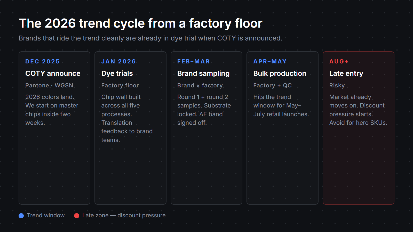
Locking the trend launch too late. Specs finalized in late summer ship into a market already digesting the next year’s announcement. April–May bulk lands inside the trend. August lock-in lands outside it.
Designing for moodboard light, not retail-shelf light. A handle approved on a designer’s desk under daylight reads differently under a Sephora endcap’s cool LED or an Ulta wall’s mixed fluorescent. Approve under the lighting your customer will actually see.
A short playbook from what is working for the brands shipping on our floor right now:
Brands that work through this list before kickoff usually save four to six weeks across custom makeup brush design and OEM brush development.
What we are seeing across the projects on our floor right now: most 2026 briefs land somewhere between the two forecasts rather than committing fully to either one.
Clean-beauty brands use Cloud Dancer as the hero and reach for sage or slate blue as the accent. Prestige and K-beauty brands lead with Transformative Teal and use soft coral or butter yellow capsules to soften the edge.
The brands moving fastest are the ones who decided early whether a 2026 trend color belongs on a hero SKU or an accent SKU, and locked the substrate decision before sample round one. The ones still debating Cloud Dancer versus Transformative Teal in February — with a May launch date already on the calendar — usually ship late or compromised.
Two practical takeaways for the rest of the season. Pick your forecast on brand fit, not on which one is louder. And treat the supporting palette as the place where most of your real production budget will live.
The COTY makes the headline. The accents do the work.
Pantone’s 2026 Color of the Year is Cloud Dancer, a soft warm white. For makeup brush production it is one of the hardest colors to keep consistent — most brands launching Cloud Dancer SKUs do so on UV-stabilized plastic handles rather than anodized aluminum, which tops out at pale ivory.
Pantone focused on calm, warm-neutral tones for 2026 with Cloud Dancer, while WGSN pushed toward saturated jewel colors with Transformative Teal. For makeup brush manufacturing the difference matters: teal is easy to stabilize in anodizing, while warm whites require tighter QC and UV protection.
For a mid-2026 retail launch, dye trials should be running by January or February. Brands that lock production by April or May ship inside the trend window; August lock-in usually ships into a market that has already moved on.
Saturated jewel tones like Transformative Teal, plus slate blue and sage, anodize cleanly inside ΔE 1.5. Warm whites (Cloud Dancer) and pale pastels do not — anodizing tops out at pale ivory with a faint silver-gray cast.
Most brands are not building full 2026-color collections. They are using one trend-driven hero SKU alongside safer evergreen shades like sage, slate blue, or warm neutrals. The brands moving fastest are usually the ones treating trend colors as accents rather than identity replacements.
